Three Rivers Charter School
Shaping a school to reflect a vision
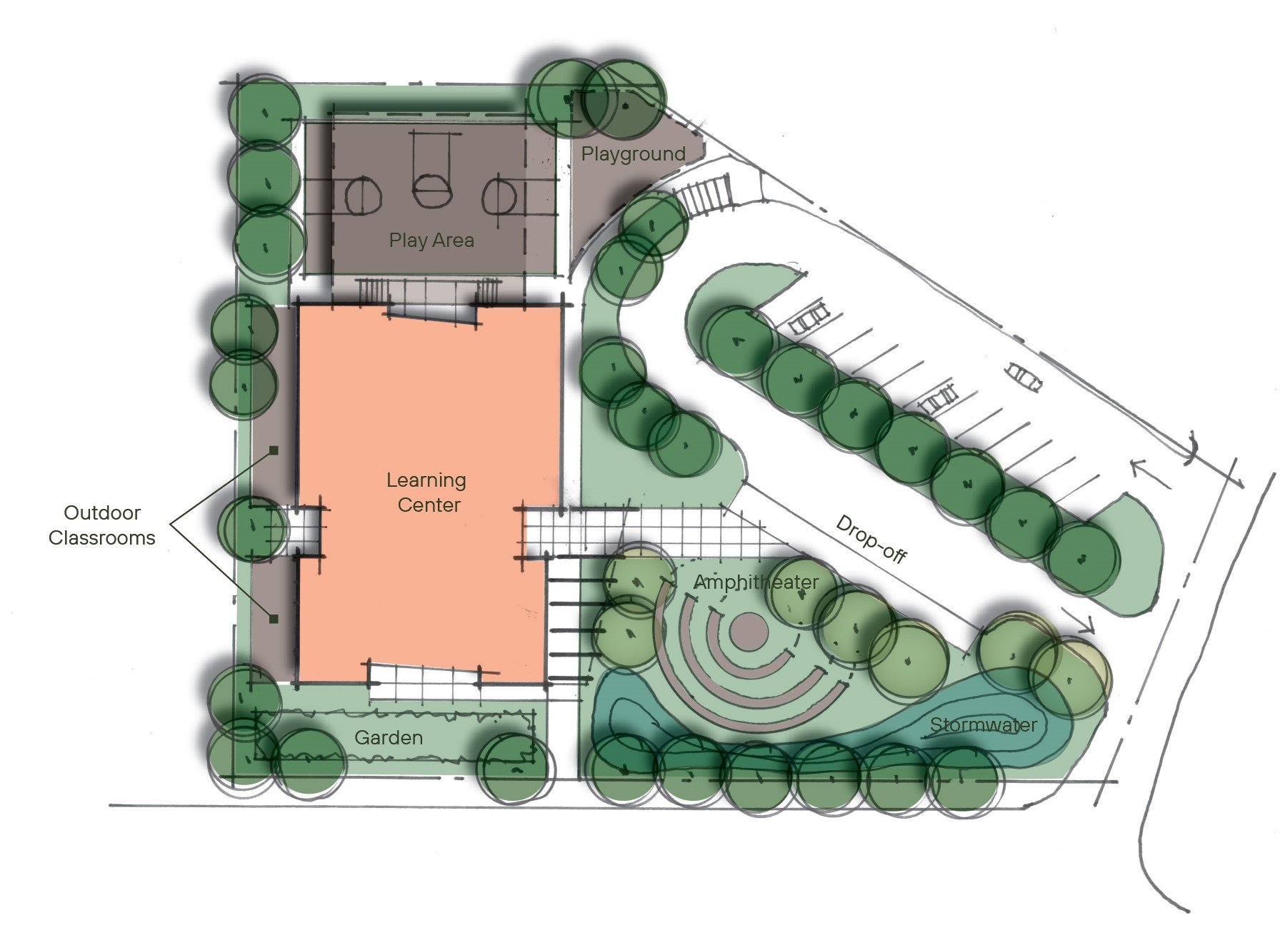
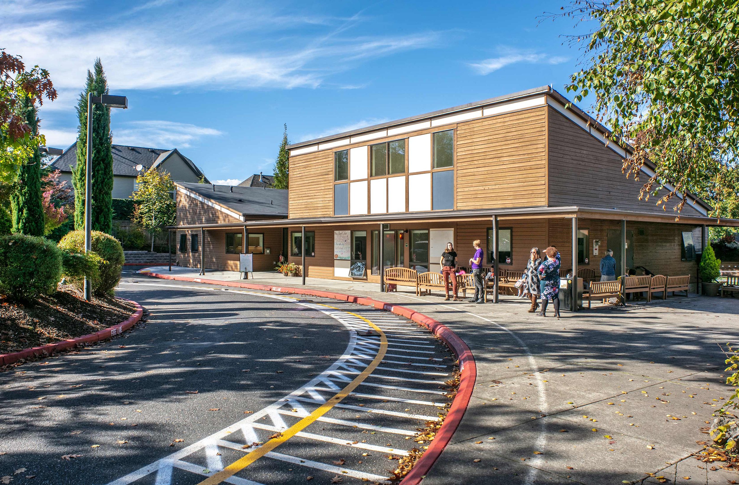
Three Rivers Charter School is led by a group of dedicated, idealistic, and creative people who have shaped a charter school of choice within the West Linn-Wilsonville School District. SEA’s work on this project took the school from a renovated bank building to a brand new building tailored to meet the school’s needs. Our design is engaging and features a mix of materials, colors, and textures. Modern lines are juxtaposed with organic elements, like boulders, in both the interior and exterior spaces, and large windows pull in the outdoors.
Client
Three Rivers Charter School
Location
West Linn, OR
Size
12,000 sf
Year
2017
Three Rivers Charter School serves 4th through 8th grades and is limited in size to 110 students to ensure that a personalized education to meet each student’s needs can be achieved. Three Rivers is based on a unique set of cornerstones: genuine relationship, academic individualization, and personal rigor. The school views education as a process and it was important to SEA to make sure that the school facility directly reflects that vision.
The design of the school supports the philosophy of the program through the use of an open floor plan – it promotes dialogue and exploration, two important aspects of the school’s education.
The interior and exterior learning spaces are connected through large windows and roll-up doors. The majority of the school layout is open concept, and there are a few enclosed classrooms when a focused space is needed. Our design enables flexibility, echoing how Three Rivers approaches schooling.
A simple structural system helped our client maintain their budget. Our design has an industrial aesthetic, exposing beams and MEP equipment. The exposed systems not only add visual interest but also allow students to see aspects of the built environment that are often tucked behind a wall and ceiling.
The students and staff were actively involved in the design through brainstorming work sessions and a full-size mock-up of the entire building that we laid out in a nearby park. The students learned how to read floor plans, basic surveying, measuring walls, and building layouts. Once the mock-up was completed, all of the students and staff used the school mock-up to test how it would actually work. This led to important adjustments in space sizes, learning area relationships, and overall building flow.
Acknowledgements
SEA Team
Sid Scott
Project Team
Keith Hoelscher Arch.
Photography Credits
Peter Eckert


