Christenson Electric Headquarters
Renovation design sheds light on office headquarters
The Christenson Electric Headquarters renovation transformed the company’s existing office from a disjointed workspace into one with intention and flow. The design reorganizes public, private, and collaboration areas into a hierarchy that supports operations and culture and is strategic with the in-between spaces and how they contribute to the overall office environment. The design-build delivery method enabled Scott Edwards Architecture, Bremik Construction, and the project team to effectively navigate several project challenges, including the need for a complete design reimagining when the COVID-19 pandemic informed how offices would need to evolve. The result is a bright, welcoming space that is functional, comfortable, and helps tell Christenson Electric’s story.
Client
Christenson Electric
Location
Gresham, OR
Size
25,400 sf
Year
2022
Achievements
2023 DJC Top Project First Place for Office TI & Major Renovation
When the project initially began in October 2019, the design entailed maximizing the site and adding 10,000 SF of new building area. Several factors inspired a redesign, one of which was the pandemic. After a pause in the process, the team restarted design in December 2020 and instead of thinking “out and up”, the concept looked inward and considered reconfiguration that would alter very little of the footprint. To achieve the desired results, a comprehensive understanding of Christenson’s operations was necessary—the interior’s reorganization carefully balances open, closed, and collaborative office spaces in response to actual, rather than assumed needs.
The entry space introduces the history of Christenson Electric through a company timeline—this storytelling piece spans an entire wall and showcases images and milestones from the company’s more than 75 years of operation.
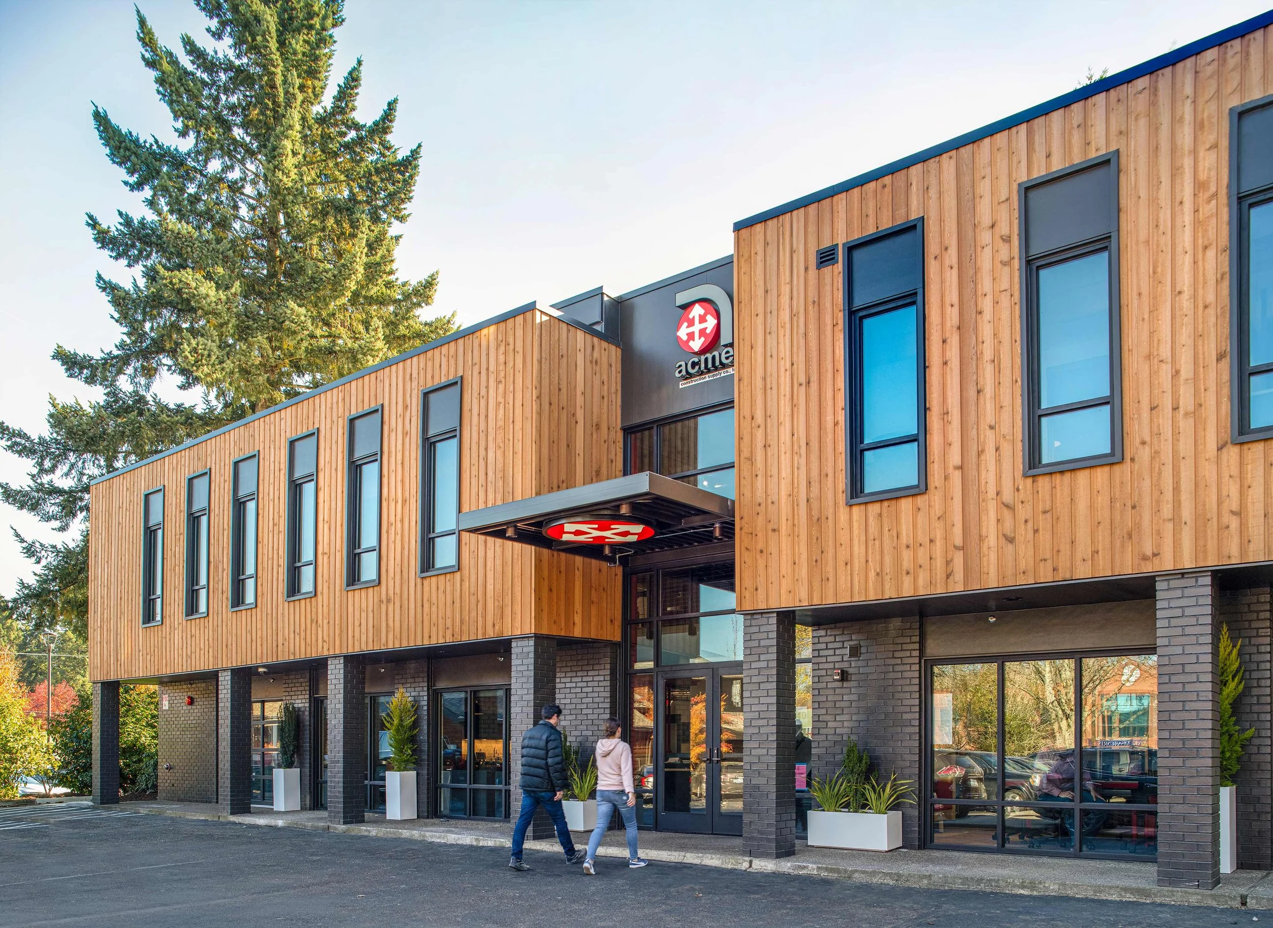
The existing office’s circulation was fractured, and recomposing the flow and creating a voluminous feel within a single story was a primary project goal. As the building’s entry is within the addition, this presented an opportunity to apply these concepts from the ground up and in a space that would have a significant impact. The entry’s design features abundant natural light, high ceilings deliberately unobstructed by ducts and conduits, and open sight lines to the reception desk and beyond.
The breakroom’s folding glass door opens onto an outdoor courtyard space complete with festoon lights. The building’s canted addition frames in one side of the courtyard, and the landscape architect, Lango Hansen, developed a design that uses plants and pavers not only aesthetically, but as a way to shield the space from the wind.
The daylighting strategy for the Christenson Electric Headquarters renovation is innovative in numerous ways, particularly when considering the project’s budgetary constraints, and found creative ways to help the space breathe. First, reorganizing the floorplan to place private offices deeper within the space, thus opening up the perimeter and letting in more natural light from windows, reduced the number of interior walls that blocked the light. The design then placed public and collaboration areas within this spine, keeping it open and bright. Similarly, skylights are installed along these main corridors, and secondary corridors have windows at their ends. The new addition’s clerestory windows, the breakroom’s folding glass door, and the increased ceiling height all contribute to this deliberate and budget-conscious strategy.
The renovation’s materiality pulls from old and new. The existing building’s brick facade is applied to feature walls in the interior, and high-use hallways are lined with warm wood. The interior designer, Bainbridge Design, offers a fresh take to Christenson Electric’s existing palette and chooses key moments to apply the brand’s iconic red. The high-impact decision to remove the acoustic ceiling tiles, thus raising the ceiling height, affected the space's feel dramatically.
The choice to remove the acoustic ceiling tiles presented a challenge in that the ducting and electrical now exposed were not originally meant to be visible—SEA and the project team collaborated to clean this area up visually, painting everything from the datum line and upward dark gray and below it white, maintaining the desired visual area.
The success of the Christenson Electric Headquarters renovation is because of, not despite, the challenges that arose during design. These challenges encouraged the project team to be strategic with space planning and creative when developing ways to shape a bright and inviting environment. Now complete, this office facilitates the company’s collaborative culture, meets modern demands, and is adaptable enough to remain flexible for the future.
The addition’s entryway and lobby, the courtyard and adjoining breakroom, a new training room, and flexible collaboration spaces all serve in prioritizing staff experience, a primary project goal.
Acknowledgements
SEA Team
Brian Mares
Jesse Graden
Sara Ruzomberka
Drew Dippel
Evan Stravers
Lane Madich
Project Team
Glumac
WDY, Inc.
HHPR
Lango.Hansen
Bainbridge Design
Photography Credits
Josh Partee


