One Community Health Hood River
A design that integrates care, compassion, and community
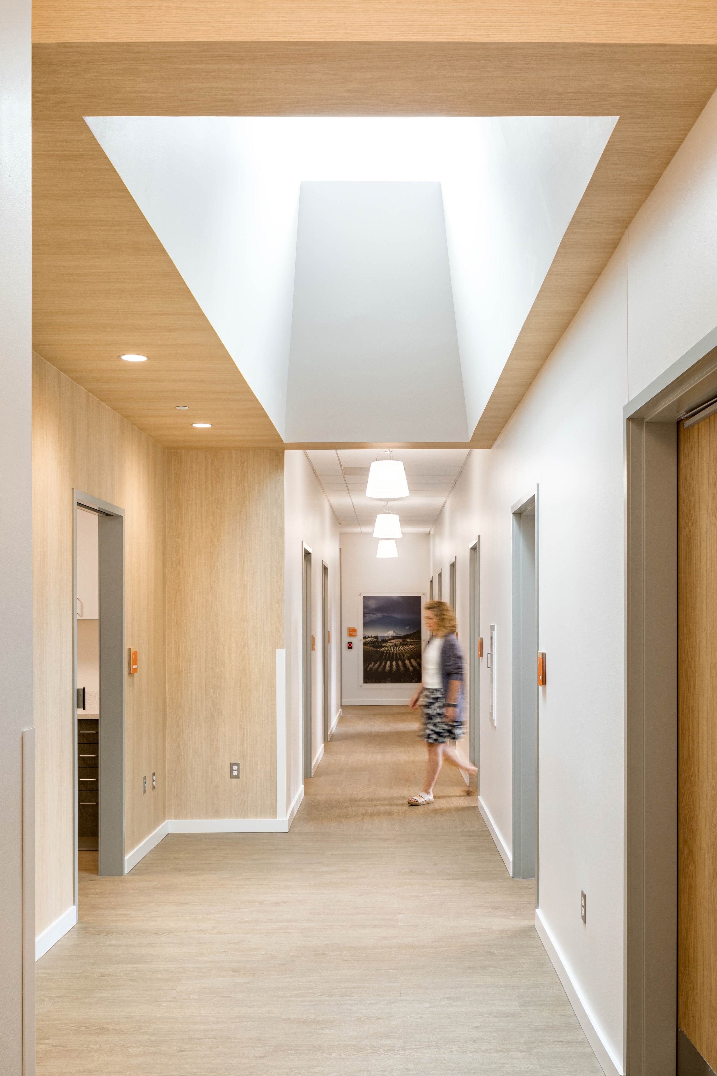
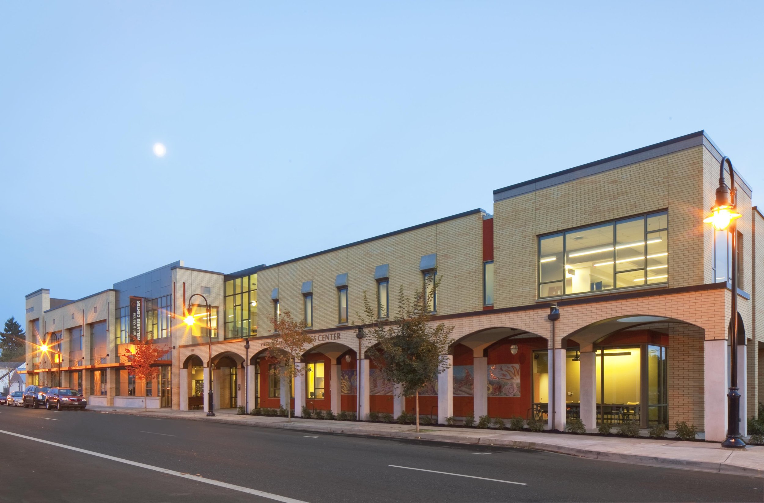
One Community Health (OCH) Hood River is an integrated health facility focusing on whole-person team-based care. Scott Edwards Architecture and the project team partnered with the clinic to reimagine and replace the site’s existing facility with a new building responsive to identified needs. The interior design centers on staff and patient experience by maximizing natural light, using welcoming materials and a cheerful color palette, and integrating clear wayfinding that clarifies navigation and zones. Trauma-informed design influenced each decision, creating a comfortable and adaptable environment that is inclusive and that promotes a positive healthcare experience for all.
Client
One Community Health
Location
Hood River, OR
Year
2020
Achievements
2021 IIDA Award
The vision for the new facility included supporting OCH’s mission to provide medical, dental, primary, and behavioral health care. The goals for the project also included expanding the space available to accommodate services like performing public outreach and educational programming to advance health and social justice in the Hood River community. SEA’s interior designers collaborated closely with the architectural team to develop zones and adjacencies within the building that streamline operations for staff and create a comfortable patient experience. The integration of the two disciplines ensured a thoughtful and cohesive design, inside and out.
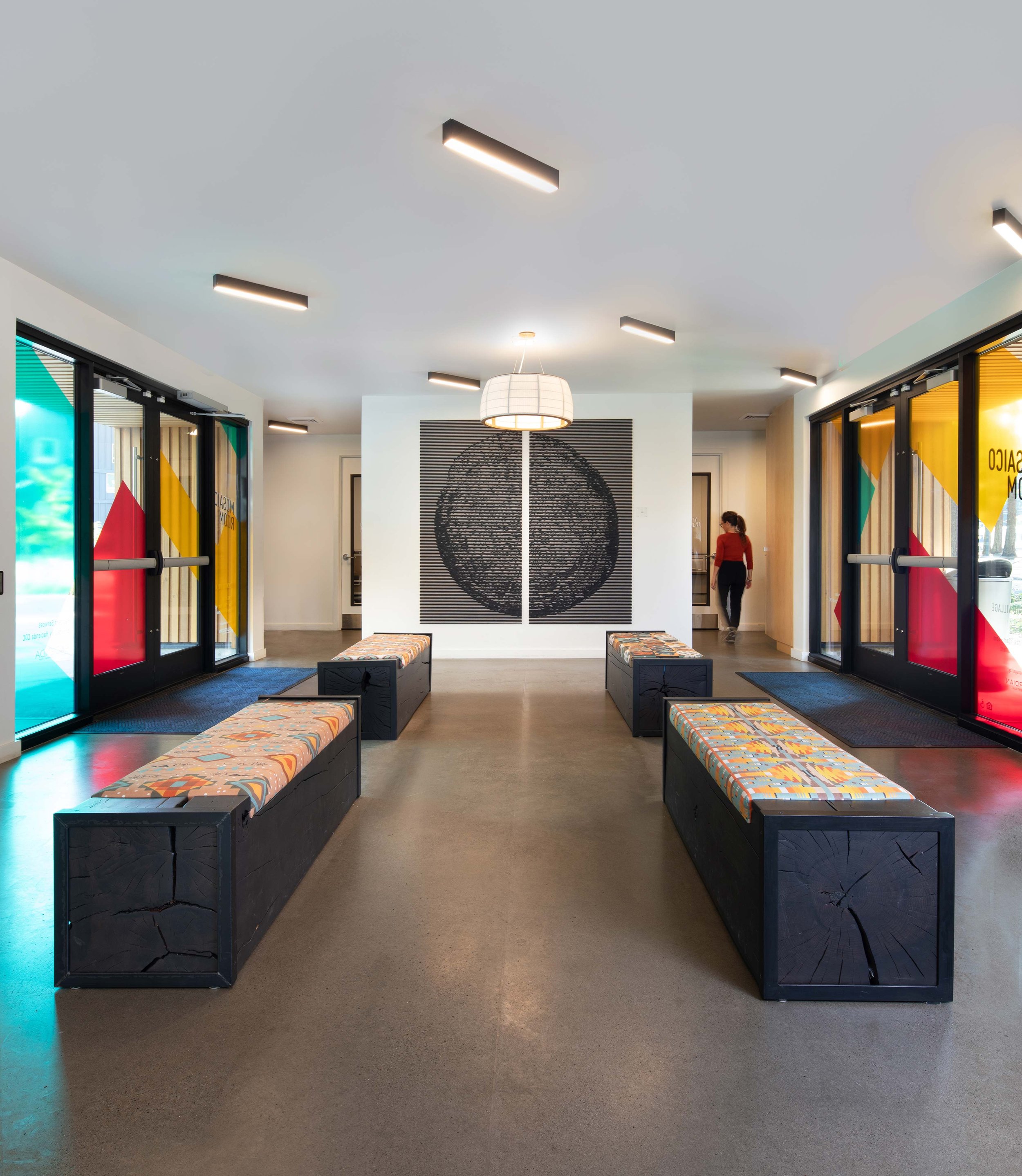
The interior is maximized using zones for gathering or waiting. When visitors enter the building, they are greeted by a welcoming seating area and powered booth seating for technology. Technology is also implemented at the ‘Learning Bar,’ a zone on the first floor encouraging patients to access OCH’s health education materials. Trauma-informed design influences the layout of the public-facing spaces. A variety of seating options are offered to accomplish OCH’s desire to have “non-waiting” waiting rooms, including strategic quiet zones like a nook under the stairs.
OCH identified the need for children-focused zones in the lobbies to support families in the community. Playful built-ins engage the users in these areas, and with the vibrant culture and youthful audience in mind, branding is inserted throughout all spaces using modern graphics and critical wayfinding signage. The result is a modern and inviting atmosphere pushing the boundaries of a typical sterile medical aesthetic.
Clear, identifiable wayfinding guides people from zone to zone, and the modernized lobbies and medical spaces enable providers to give the best care to their patients.
Materials like wood and stone contextualize OCH within the Hood River area, as does the photography throughout the space that features nearby places.
All materials selected are inspired by the local landscape—from the water of the Gorge, basalt-like entrance tile, and dark and light wood elements. The design uses splashes of color, textures, and a mix of furniture to break up the space, and patients can comfortably maintain distance in the bright and open waiting areas.
Design studies focusing on the user experience were expanded beyond the patient to include OCH staff. From these studies, we learned more about the day-to-day of the care team and identified opportunities to elevate staff-specific areas. These studies also informed the decision to add an uplifting and multi-functional breakroom to the scope.
OCH set out to build a new facility that would serve as more than just a medical building. The goals were ambitious, but the need for a comprehensive healthcare facility to deliver essential services to Hood River and the surrounding areas was high. The attention paid to detailing and thoughtful planning provides all the required dense programmatic spaces in this 36,000-square-foot building while still being transparent, bright, and welcoming.
Acknowledgements
SEA Team
Cameron Cruse
Hayley Purdy
Dave Mojica
Lisa McClellan
Evan Stravers
Project Team
Bremik Construction
Interface Engineering
WDY, Inc.
Shapiro/Didway
HHPR
Photography Credits
Josh Partee
Quanta Collectiv


