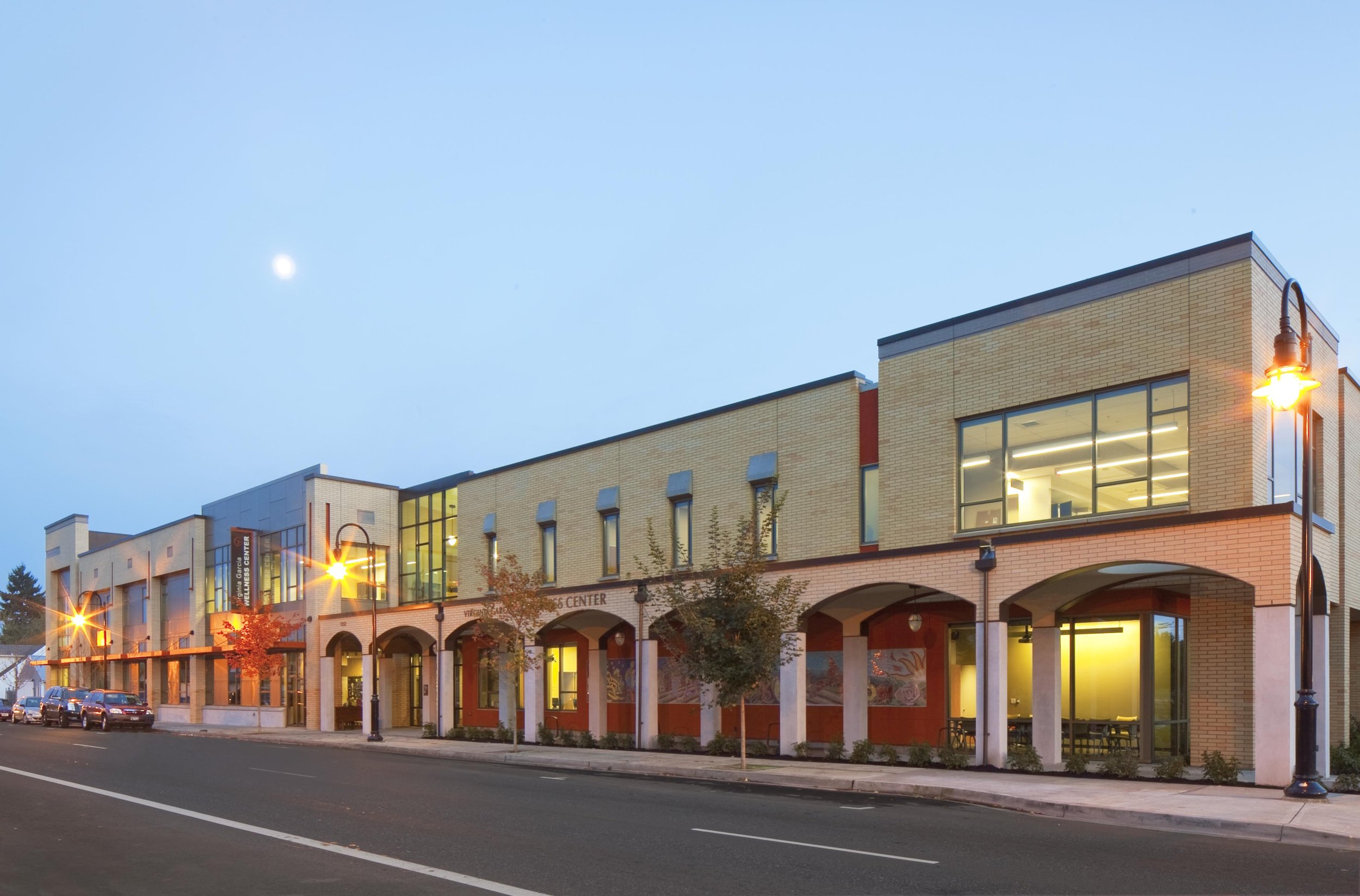
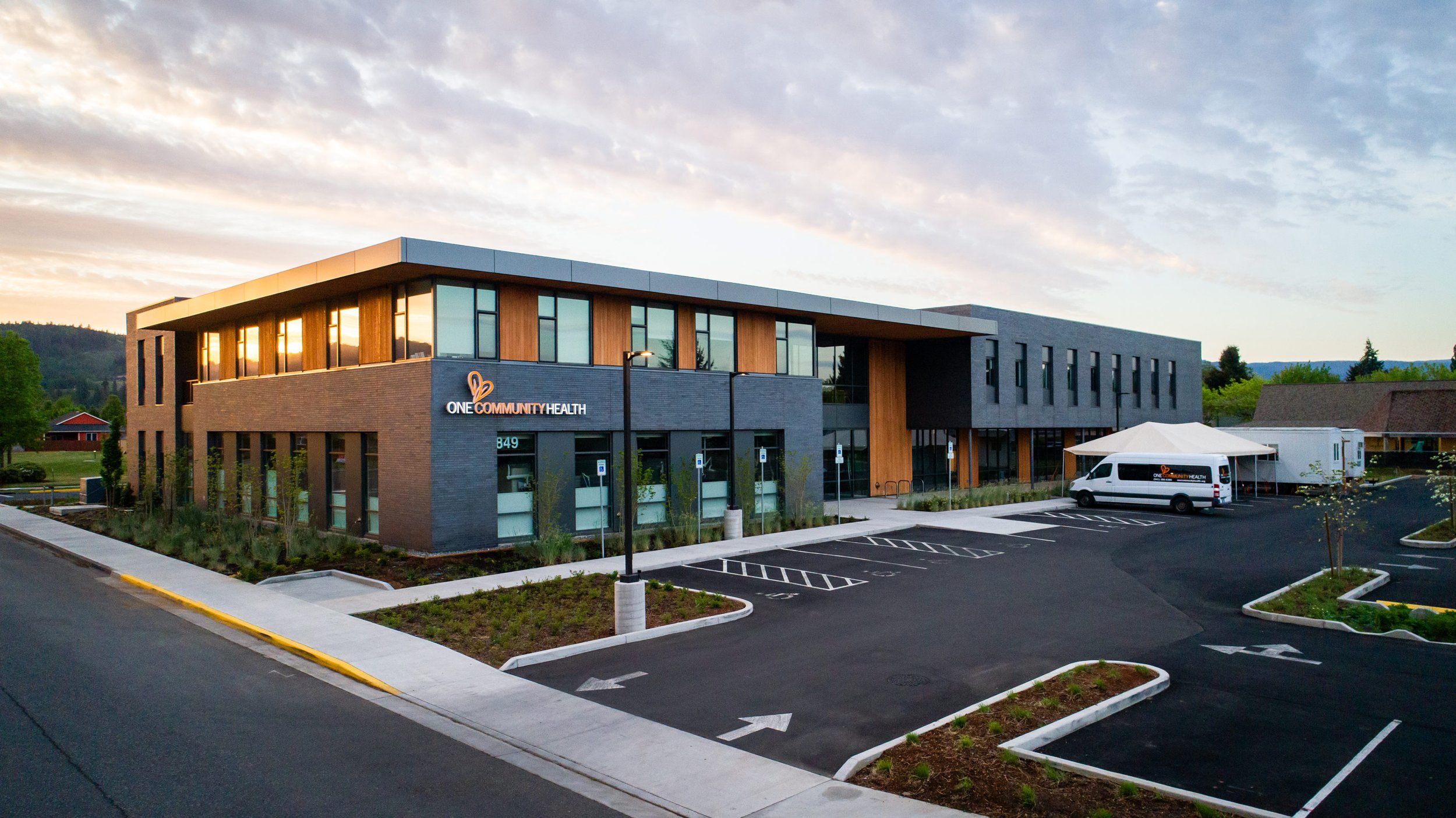
Virginia Garcia Newberg Wellness Center
Culturally-informed health and wellness center
Virginia Garcia Memorial Health Center’s (VGMHC) Newberg Wellness Center project is a renovation and addition to an existing building expanding the health, dental, and wellness services they’re able to provide to the community. Scott Edwards Architecture collaborated closely with VGMHC to create a design that considers the surrounding commercial and retail neighborhood and the program requirements and delivers culturally appropriate healthcare to their primary demographic, the Latinx community. The design concept is inspired by a mid-century Mexican modern aesthetic, pairing simple forms in saturated color with traditional materials like stone, stucco, and heavy timber. The experience of patients and staff is prioritized in the functionality of the floorplan, with ample natural light and access to outdoor spaces, and a comfortable interior guided by trauma-informed design principles that promote well-being in the healthcare environment.
Client
Virginia Garcia Memorial Health Center
Location
Newberg, OR
Size
22,733 sf
Year
Estimated December 2024
SEA enjoys a longstanding partnership with VGMHC reaching back to the firm’s founding—our very first project was a new Virginia Garcia dental clinic. The Newberg Wellness Center, as with their other locations, is mission-driven and emphasizes those they serve in both program and design. This renovation and addition transforms the existing 1990s building into a modern, vibrant new facility inside and out. The program includes a medical office with exam, treatment, and consult rooms, a dental office with operatories and x-ray spaces, a pharmacy, lab services, a multi-purpose wellness center, and administrative support areas.
The design is informed by mid-century Mexican modern architects Luis Barragan and Ricardo Legorreta, a direct tie to Latinx culture as this is the community most closely connected to the wellness center. The main south elevation of the building is composed of a collection of colored box forms ranging from tan for the base massing block to a rich rust color for the pharmacy, wellness center and stair tower masses, and a vibrant gold for the main entry. The collection of forms is connected to an outdoor arcade running around the building's west, south, and east sides. The arcades are punctuated by gridded breezeblock screens that act as filters for the sun and provide colorful accents. Above the main blocks are the mass of the wellness center and an outdoor terrace that connects to the staff break area. Additional design elements like timber grids and deeply punched openings are inspired by mid-century Mexican modern.
The outdoor spaces along the arcade include a community garden with raised beds for fresh herbs and vegetables, an outdoor plaza with tables and seating for lunch breaks, stopping points for patients, and a small pavilion for bike parking with a covered area housing bicycle repair tools available to the community. The project also incorporates a small landscaped child play area with raised berms and seating, and it will emphasize culturally appropriate art installations that enhance the built environment and create community—several large-scale murals are planned throughout the development. The site design also includes a walking exercise trail with intermittent exercise equipment. These elements support the client’s goal to provide a safe, engaged, and culturally-appropriate, welcoming environment.
Make it stand out
The landscape design promotes pockets of respite for both visitors and staff. It complements the architecture by creating moments that give a nod to patterns and textures used in the architectural design while also supporting the community-centered approach to make usable, comfortable, and engaging outdoor spaces. Rendering courtesy of PLACE.
The building’s new addition is organized along an interior circulation path called “The Street”. This main spine has exposed structural glulam columns, murals on the walls, orange felt grids suspended from the ceiling, and large modular skylights at each circulation intersection.
The wellness center’s interior design is driven by four principles: Patient-Centered, Collaborative, Empowering, and Inviting. The concept of trauma-informed design guides the approach to materials and the flow between spaces and a contemporary color palette emphasizes saturation and vibrancy to encourage healing. Architecturally-refined interior elements meet bold and expressive floor and ceiling materials that serve as wayfinding throughout the building and the space planning allows areas for artwork to be incorporated.
Sustainability is integrated into the Newberg Wellness Center as well. The addition adds square footage to the north of the building and has a 6,000 sf roof sloped slightly to the south designed for solar panels. The roof can support roughly 80 kw of solar, enough to produce approximately 86,000 kWh per year. The project was awarded an Energy Trust of Oregon grant to incorporate a solar array on the addition’s roof and the expected pay-back period for the cost is a little over 4 years. The project also includes enhanced indoor air quality measures, sustainable product selections, enhanced exterior envelope performance, and whole wellness for staff and the community. The carpet we specified, supplied by Patcraft, contains an average of 61% recycled content and includes 762 square yards of Carbon Nuetral EcoWorx carpet tile.
Acknowledgements
SEA Team
Sid Scott
Margaret Wilson
Kathy Johnson
Fabio Arias
Tim Gordon
Quinn Lindstrom
Trent Jorgensen
Project Team
HHPR
WDY
PLACE
Interface
Photography Credits
Renders by SEA


