Thoughtful Planning in Small Clinical Spaces
Author
Chris Rymal & Mark Steinhardt
Healthcare provider models, both human and pet, have evolved significantly over the past two decades. Technology has progressed in such a way as to make “on-demand” healthcare possible, and market research leads to deliberate clinic location selections based on need, rather than what in the past may have been sole-proprietor preference. These changes necessitate a different approach to clinical spaces and how they’re designed.
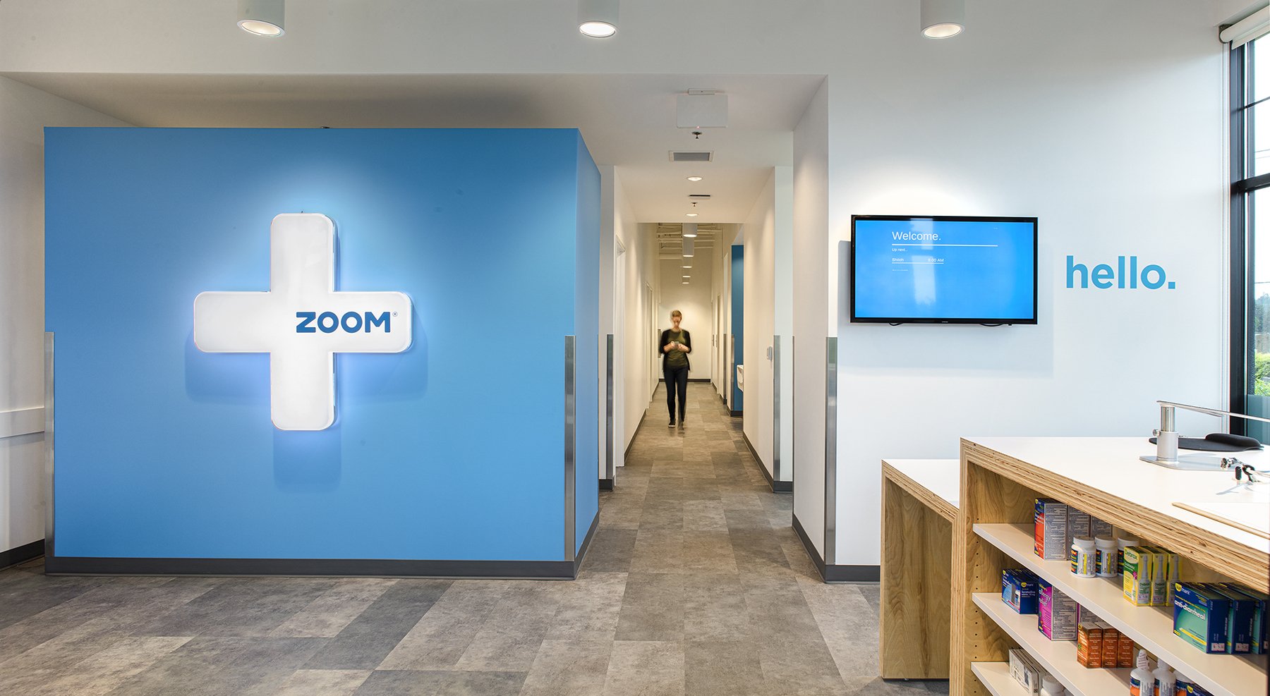
Scott Edwards Architecture has designed over 100 of these small clinical spaces. Through this work, we’ve encountered challenges and opportunities that have led to a comprehensive understanding of their needs. Some of our larger clients, such as ZoomCare and Banfield Pet Hospital, have a specific program for their clinics, and regardless of the building’s floorplan, all elements need to be incorporated. Consistent user experience across all locations, plus scalability of design, are vital components in this modern healthcare model. Thoughtfulness and the ability to be nimble are paramount.
Consistent user experience across all locations, plus scalability of design, are vital components in this modern healthcare model.
Leased space differs greatly in size and layout, so while the client’s program is often standardized, how we design for that program is not.
The vast majority of our small clinical projects are tenant improvements in leased space. Square footage, overall spatial proportions, columns, storefront attributes, and points of entry are all variable. Optimizing a prototype clinic layout given a different set of constraints in every instance can be challenging. Similarly, the client’s program, while largely standardized, is always evolving based on wide-ranging input from a multitude of vested parties. Parties can include lead doctors, design managers, and construction managers at the company’s headquarters, the clinic’s practice manager, the site landlord, and even a demographic analysis department, just to name a few. We’ve found that anticipating unexpected requests and listening carefully to the client’s concerns is essential to delivering a successful design.
What helps us to anticipate these needs is repetition and familiarity with our clients. SEA has developed what we call a “library of prototypes”—with a wide array of existing space shapes and sizes in our clinic portfolio, we can borrow a design from our library as a starting point, and then customize from there. Opportunities for greater efficiency or for providing more appealing clinics are often discovered through the exploration of design ideas within odd lease spaces. One may not initially think that a space will be ideal or even work, but we keep an open mind and often discover that the clinic benefits from the challenges. We strive to capture unusual constraints and use them to our advantage.
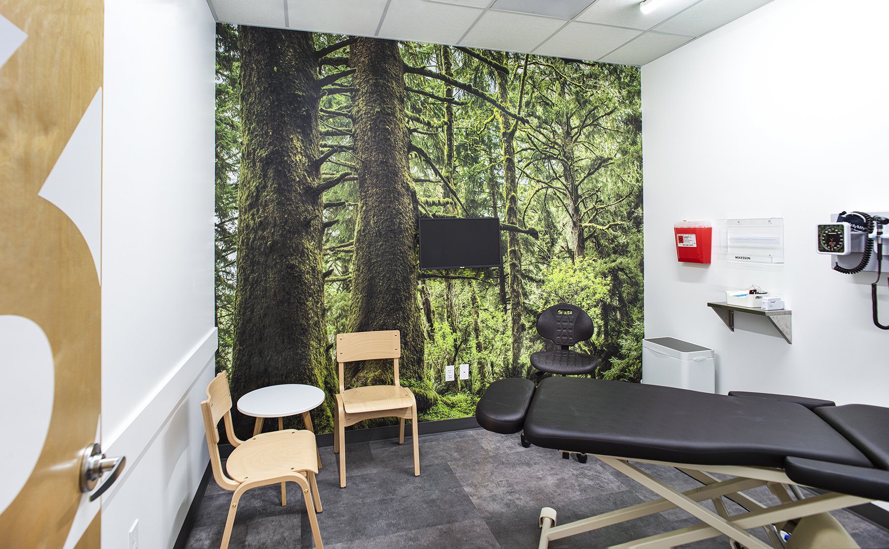
Whenever possible, we incorporate personality and a sense of place in the clinic’s design. The clinic pictured here is located in the Pacific Northwest, so we use wood furniture and accents, plus a statement wall celebrating the surrounding forest.
An example of this is a Banfield clinic we designed in California. On first glance, the leased space did not appear to be ideal from what we knew would be needed in Banfield’s program. The space included existing wide flange columns, stairwells, an elevator core, angled walls, and an overall odd geometry. In keeping with our approach to having an open mind, we investigated further and learned that many of the unique features actually worked in our favor. One instance of this is the serendipitous width of one of the existing stairwells–it sets the adjacent x-ray and surgery rooms to the correct size, allowing us to maximize the layout while using an unchangeable space feature.
Similarly, since the stairwell, x-ray room, and surgery room are all aligned on one side with no wall jogs, we were able to design a long, uninterrupted length of casework in the treatment room, which is ideal from a Banfield operations standpoint. Also notable, the break room is well lit and has immediate street and transit access, which is not always a given and certainly a convenience for employees. Working within this atypical layout proved to be a benefit to our client and for those who use the space.
Floorplan of the Banfield clinic SEA designed in California, mentioned above. Our design maximizes the space despite the odd geometry and interruptions to flow, like stairwells and an elevator core, by piecing the program together within the atypical layout.
SEA’s approach to clinical space planning is like putting together a puzzle—pieces are identified, tried, and placed until we find the perfect fit. Before we visit our prototype library, our process starts with learning from the client what they need and noting what may be different about this location as opposed to others for the same client. We take time to learn the site and the surrounding area, plus any local jurisdiction codes that may impact the project.
SEA’s approach to clinical space planning is like putting together a puzzle—pieces are identified, tried, and placed until we find the perfect fit.
Even after we select a previously successful project from our library as the precedent, we know that our work is far from complete. We understand that it’s not always as easy as plugging in an old plan and amending it to fit within a new shell. As mentioned previously, the client’s program has most likely undergone adjustment since we completed the precedent design. Knowing this, we integrate lessons learned or program changes into the new plan to improve upon it. We also review construction document records of the precedent project to learn whether any significant changes later in the project’s schedule should be taken into consideration in the current space plan design.
The most considered puzzle piece in our planning is the space’s impact on people. The adage “form follows function” is very true in this project type. Having an intimate understanding of the clinic staff’s day-to-day functions informs our strategy—when space is limited it is vital to ensure every bit of it supports efficient operations. Through our experience, we’ve learned that even though we may be able to force all the required equipment into a small floor plate, we also need to consider mobility around the equipment as staff often require specific clearances in order to do their job effectively.
A bright, comfortable, and spacious exam room at a SEA-designed veterinary clinic.
The same can be said for ADA clearance requirements. We include a layer in our drawings that specifies ADA clearances throughout the clinic, ensuring code compliance and ease of patient and staff use. Lease space is expensive, and we always take another look at our plan when we think we’re done to confirm we’re allocating space in the most efficient way. We aim to find ways to carve into underutilized space, often through collaboration early in the design, to make the clinic more valuable for the client and more functional for end-users.
As SEA designs small clinical spaces, we imagine ourselves in the shoes of patients and staff. Healthcare, human and pet, can be incredibly stressful. Accessibility, a familiar and replicable experience, and efficiency are features that we understand drive those who choose places like ZoomCare and Banfield for their services. Our clients build out their clinics where a need already exists, even if the ideal space does not. Through good, thoughtful design SEA is happy to piece together even the most challenging of these clinical space puzzles.
Read more about our Banfield Pet Hospital and Zoom+care projects.


