An Approach: Part I
Author
Adrienne Allaert & Jesse Graden
An incomplete and personal list of principles {and notes} on how two designers use rigor, emotion, and idealism to make the most out of their projects and their days.
In this two-part series, we’ll attempt to define the undefinable and distill that which cannot be distilled into a loose formula for discovering and building meaning. Rules that are not rules, principles that are non-linear by design. We hope these thoughts cause you to look both inward and outward, to see what is resonant, and evolve what is not.
No. 1:
Make It Visceral
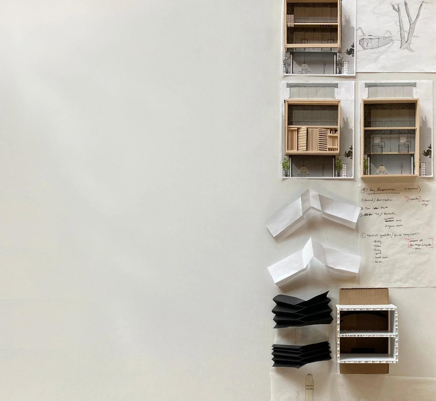
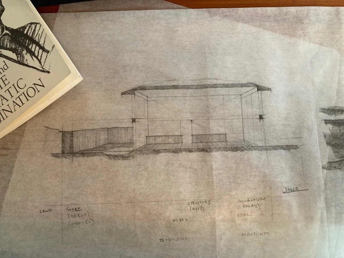
Buildings are meant to be touched. From doorknobs to faucets, we interact with the spaces we occupy. The design process should be equally as engaging and tactile. Often, the act of folding paper or assembling a model or simply feeling a material can inform the design in deeply meaningful ways.
{ Architecture is many things. It can be foundational, shelter from the elements. It can aid us in our work, provide at hand all the things we functionally need. It can be a boundary, a space we call our own. For us, these represent minimums. The thing that allows a space to transcend to be a place is meaning. Meaning can be the backbone of it all, providing structure, and making an experience. Above all, meaning is what allows us to engage, to feel like there is a place for us. }
No. 2:
Always Be Contextual
Every action needs a locale—indeed activities take place—and buildings follow the same rule. We extend that concept throughout our process—how can a project’s site inform its interior spaces? How can the building’s internal elements be echoed outwardly? Can we extend miniature anchors both into and out of the building and site to mutually ground both?
{ Sometimes you hear a really good pop song, and the lyrics describe a very specific drama that you have never experienced, but somehow the raw truth of it makes you feel like you are right there. If we can bring specific truth to our design by telling a story that can’t be told anywhere else, by embracing and amplifying that unique mix of elements that made the project come to life, we have a chance at connecting with the future inhabitants and allowing them into the amazing depth of the place. }
No. 3:
Embrace Delight
Architecture tends to be quite serious. When, during the course of our work, we encounter moments of whimsy or wonder, we choose to take a breath and enjoy these happenings by celebrating them in the project. Sometimes it comes out of a quick sketch that makes us smile, other times it may be an opportunity for a light-hearted design detail. We embrace these pauses and feel they make our projects better.
{ You get out what you put in. This applies to design rigor, certainly, but it also applies to the state of the person doing the creative work. Are you putting in stress, dissatisfaction, sourness? Or are you able to instill a sense of resoluteness, a sense of curiosity and delight? If we allow these things into our process, into the way we spend our hours, that will be reflected in the work. }
No. 4:
Decisions Should Be Self Evident
Being led by a clear message, all elements should work together to tell the story we have crafted. One way we can check that is to see how obvious the decisions are. In most cases, the design decisions that make us say “Of course!” are the right ones.
No. 5:
Get Dirty…
...move around, and get lost. Do not ever be afraid to roll up your sleeves and get your hands dirty. This can take many forms. Sometimes this is you picking up a shovel (or a hammer or a welding torch...) and literally getting dirt on your knees. Sometimes it is making an absolute mess of your design or drawing while you chase an idea. Still other times it’s you chasing a thought to an author, a book, a movie, or a painting until you forget where you started but know with certainty where you want to land. In any case, stand up, take a walk, and go somewhere you’ve never been and try something different.
{ We often say “People First” and we believe that starts with us. Only when we are nourished, can we nourish others. By bringing the stories that feed people to life, we put some of their deepest needs first for beauty, for wonder, to be part of a story. As Robert Edmund Jones writes about theater that is more mechanical than emotional: “There is no dramatic nourishment in it. We are hungry, and we are given a cookbook to eat instead of a meal. We expect to go on a journey, and we have to be satisfied with a map and a time table.” }
No. 6:
Transcendence of Use
“Elements must be of use but also transcend their use.” -Tod Williams & Billie Tsien
As architects, we challenge ourselves to create multivalent solutions, to approach problems in ways that solve for more than one thing at a time. Taking this further, can solutions to problems provide not only objective function but offer multiple subjective meanings or interpretations as well? It is important--even necessary--for repeated visits to a building to elicit new emotions and reactions while at the same time serving the function for which the building was ostensibly built.
{ The move from objective to subjective is crucial. Yes, we are obligated to bring an object into the world (a building, dining room, a table) but when we bring the feeling of hospitality, the warm welcome of a meal waiting for you, that’s when we feel we are getting somewhere important, somewhere transcendent. }
No. 7:
Amplify the Ordinary
In this case, we’re referring to the plainest use of a material, its “ordinariness.” Understand the nature and character of materials. Learn their behaviors and quirks; what to do with/to them, how they will rebel when mistreated and play when respected. Use that understanding to give lesser-heard materials opportunities to have new roles.
{ Sometimes as designers we hear “But will anyone notice?” and our belief is that folks who pay attention should get a reward. The more you engage with a place, the more it should give back to you. It doesn’t have to be clever, or expensive (as they say, proportion, composition and color are free) but it does have to be intentional, and give back to the inhabitant a piece of the story. }
No. 8:
Design the Hard Way
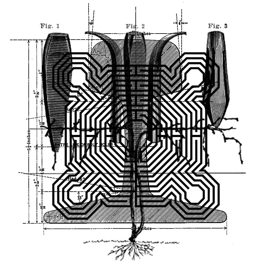
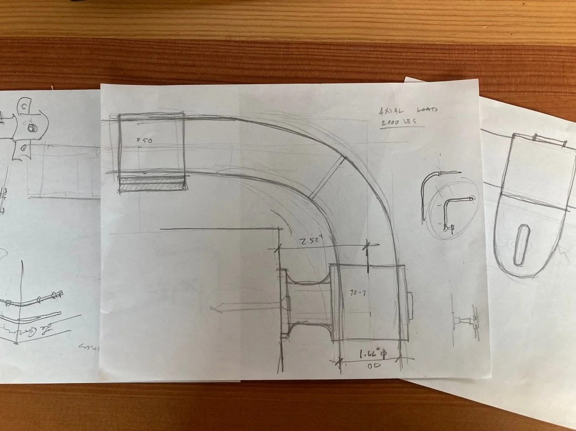
When bending steel stock, it’s easier to bend it along its weak axis (Y-Y). When you want to bend it along its strong axis (X-X), its called bending it “the hard way.” There’s often an obvious or expected solution to a design problem (perhaps the “easy way”). But sometimes we avoid exploring avenues of design because they seem like more work. Uncovering good design takes work. The obvious solution may in fact be the best one, but don’t rely on assumptions and do the work to discover that.
In the next part of the series, we discuss the application of these principles in a process that gets to the heart of things.

