Unhide your Emergency Department with Site Planning & Design
Author
Alden Kasiewicz
Taking a friend or a loved one to the emergency room (ER) can be a frightening experience. Emotions are running high; time is of the essence and often we’re not exactly sure where to go. Research has shown that elevated stress levels can reduce our ability to make decisions. Couple that with driving quickly and we may find ourselves asking: Should I have turned there? Is that the ER over there? Maybe we already missed it?
Not all trips to the ER play out this way, but it’s easy to see how it happens. Making the ER easy to find is critical to a positive patient experience, yet so often we hear stories of frantic ER patients ending up at the wrong location.
“Approximately one third of our ER patients arrive in an ambulance, which leaves upwards of one hundred and fifty people finding our ER on their own on any given day. 24 hours a day there are patients that unexpectedly require treatment for a number of illnesses and/or injuries, some of which are life-threatening and do necessitate immediate care. For those with life-threatening concerns, every second counts and the fewer steps needed to find our door, the better.”
RN, Salem Health Director Of Emergency And Trauma Services
With our recent campus expansion project at Salem Health, we had the opportunity to redesign the vehicular approach and patient entry for the busiest Emergency Department between Los Angeles and the Canadian border. Here’s what we learned along the way.
Why are Emergency Departments Hard to Find?
In addition to the human factors at play, there are common environmental conditions that can contribute to confusion for the hospital visitor. Successful hospitals can be negatively affected by the community growth that fuels them. A site layout that once worked well can become convoluted and counterintuitive over decades of growth in response to community need. Without a strong, long-term development plan in place, an addition here or a new building there can quickly “bury” an emergency department at a hard-to-find location in the center of a campus. Additional parking lots, new roads, and a constantly maturing landscape can further contribute to the obscuring of the ER.
Unfortunately, relocating the emergency department to a more intuitive location usually is cost-prohibitive due to the interventional services that are typically located near the department. Even when a hospital considers moving the emergency department, it will often remain in its original spot regardless of how the hospital may have grown around it.
Furthermore, emergency departments are often intentionally located away from the main entry or easy-to-find “front door” of the hospital, so that ER and non-ER patients can have distinct, non-overlapping hospital experiences. This approach makes sense when you consider the diversity of patient care administered at a hospital – the family members coming in to see mom and new baby should not walk through an area solely focused on emergent situations. However, “away from the main entry” often translates to the back; or side of the hospital, and in this situation, there are few options other than signage to guide the ER visitors in.
Reliance on signage alone to help people find the ER can also be problematic. Zoning codes can limit the size and location of the signage, resulting in smaller and fewer signs than desired. In addition, hospitals can easily suffer from over-signage, and amongst a sea of other hospital signage, critical emergency signage can get lost.
Salem Health Campus Expansion
Our first step with the Salem Health design effort was to remove all potential distractions and create a space dedicated to ER drop-off. We relocated emergency department parking to a conveniently located parking structure. We removed all non-emergency traffic from the area, and created a one-way flow in and out of the drop-off. We selected low shrubs and ground cover for landscaping and worked with the City of Salem to carefully place our street trees. To further eliminate distractions, the usable square footage adjacent the drop off was programmed with back-of-house uses that don’t require an entry or windows, keeping the focus on the ER entry. Once in the approach, the visitor is funneled directly to the drop-off point with no distractions along the way.
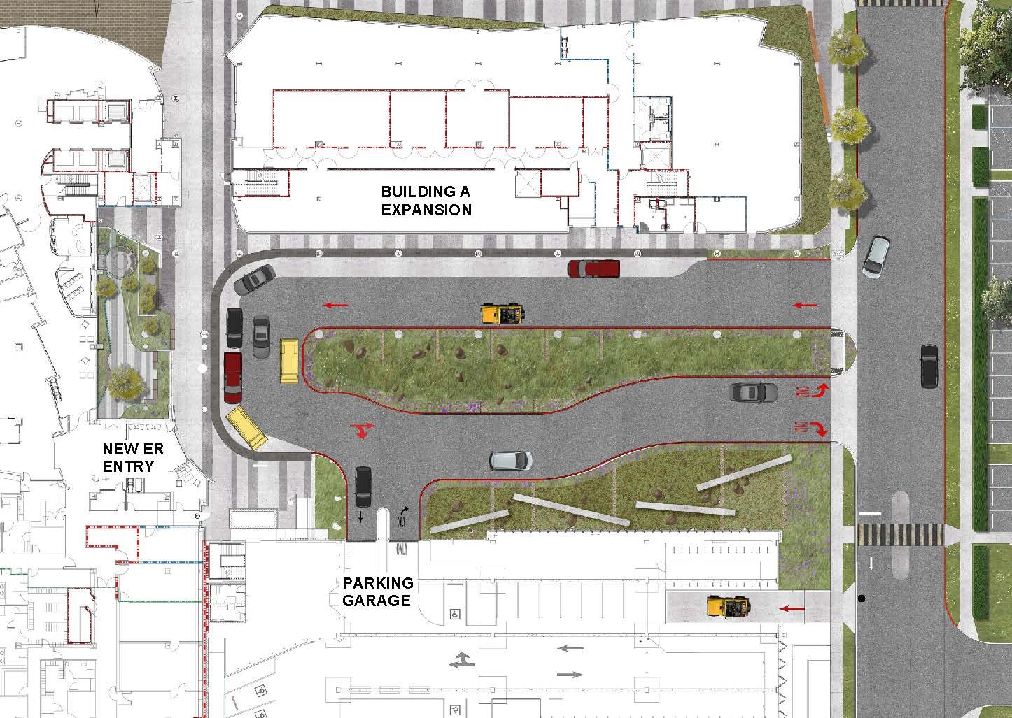
New site plan with dedicated ER drop off area and plaza
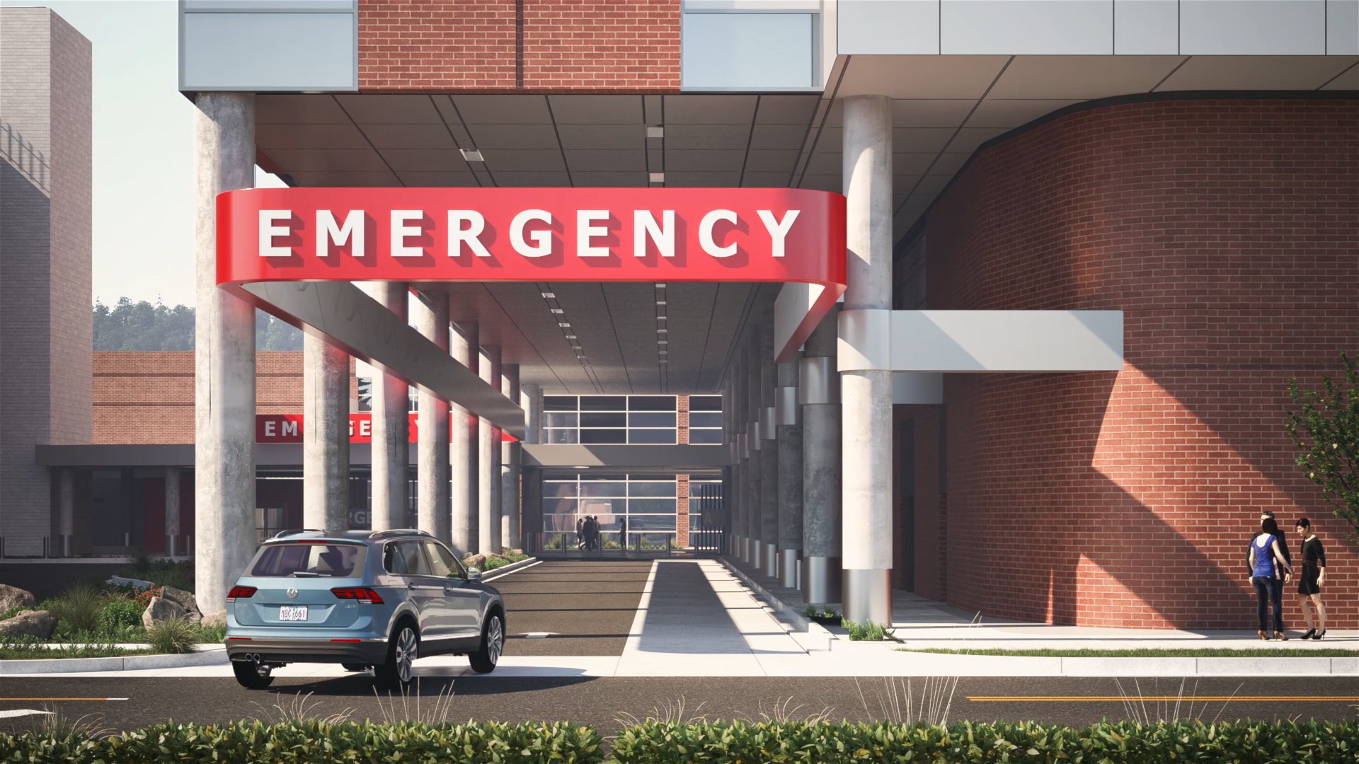
In addition to the drop-off, we also redesigned the ER entry to be more intuitive. The entry is angled to directly face the primary drop-off point, improving sight lines and making it easier to get in the doors. We clad the entry in red metal panels, and gave the primary elevation a concave footprint to “catch” ER visitors and direct them into the entry door.
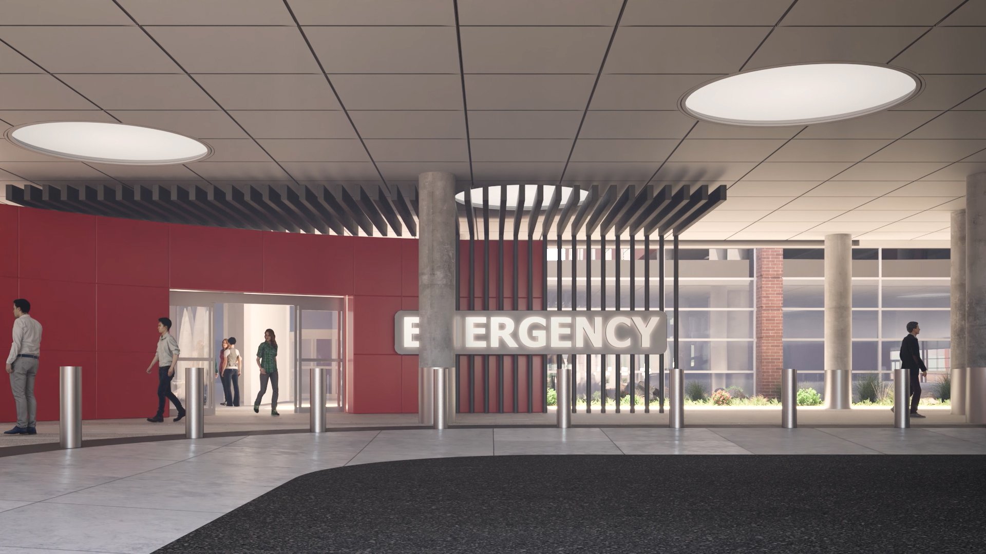
New ER entry, branded red with integrated signage
“A decade ago, we moved the emergency department across campus into a larger footprint closer to the bulk of our parking. As we continue to expand, the emergency department will become the center of campus, requiring long term attention to its visibility.”
Salem Health Director Of Facilities Development
With a dedicated, user friendly drop-off and entry in place, our next goal was to get patients to them. Several surface roads serve the site, and our goal was to create a unique visual cue, visible from multiple locations, that emphasized ER.
To address this challenge, the idea of the ER ribbon was born. A 4’ tall, flowing red band cantilevers out over the sidewalk at the main vehicle turn-in point, and then follows the route from the street to the ER entry door. The ribbon was integrated into the design of the adjacent building as an architectural feature, and is internally illuminated to ensure nighttime visibility. The red metal panels used for the ribbon are the same as those used at the new ER entry, creating a common material language that indicates emergency use.

New ER ribbon seen from street level

New ER ribbon seen from above, cantilevered out over the sidewalk to maximize visibility
With these pieces in place, our efforts turned to signage as the final tool in our wayfinding arsenal. We started the process by hiring an environmental graphic designer to take the lead on signage design. However, as we began to design for the new ER drop-off and entry, we realized we needed to take a step back and look at wayfinding on the campus as a whole. To do this, we utilized a campus model that had been developed earlier in the project for master planning and logistics purposes. We built small diagrammatic versions of the various signs within the campus standards, and started tracking potential paths of travel to the new ER and locating signs accordingly. This work remains ongoing, but the use of the model has been instrumental in thinking through the signage, validating the solutions and ultimately presenting the solutions to leadership for approval in a simple, easy to understand way.
A Better Patient Experience
So much of healthcare design is focused on improving the patient experience, and it’s critical to remember that the experience begins the moment the patient drives or steps onto your campus. Take some stress and confusion out of what is often a difficult experience by developing a coordinated plan that gets your patients from surface street to ER entry.
Takeaways
Don’t try to serve multiple needs in your ER drop-off area. Let the portion of your site dedicated to emergency drop-off remain dedicated.
Be ever-conscious of the view to your ER. Review sight lines regularly, and adjust as needed to keep the ER entry visible.
Make a bold move. Use large architectural gestures to catch people’s attention and help bring them in.
Don’t rely on signage alone. Be incredibly thoughtful with the signs you place.

