Elevating essential elements makes best use of interior design budget
Author
Susan Balogh & Cameron Cruse
The idea that budget should not preclude good design is a fundamental belief held by our Interiors team at Scott Edwards Architecture. The truth is, with thoughtful, responsive solutions, you can realize goals even with your commercial interior design on a budget. Here at Scott Edwards Architecture, we see construction costs climb and no sign of projects slowing down, and our approach is to find ways to create design opportunities using basic, essential elements—sometimes something as simple as “flooring” or “wall base” on the project’s program list can be considered an essential element. By doing so, we take project components that will already be incorporated, and we elevate them. We’ve found that by identifying these opportunities early in the process and prioritizing meaningful decisions we can have a significant impact without significant cost.
“The idea that budget should not preclude good design is a fundamental belief held by our Interiors team at Scott Edwards Architecture.”
Through experience and a willingness to get creative, we’ve developed many strategies for commercial interior design on a budget. When we break down the interiors of a building, the bare bones are walls, ceilings, and floors. With a tight budget, our designers make a short list of the very basic interior applications that are needed to extend the life of those primary surfaces and provide basic user needs. Walls need paint and wall protection, and users need light, wayfinding, and acoustic accommodations. Our interior designers find methods to use these necessary elements as tools to convey a company culture and brand, and of course, develop an attractive aesthetic.
As we examine a new building plan, we look for design opportunities that focus on what is essential for that particular space – no two buildings, clients, or communities are exactly alike. We can, however, apply similar best practices from our experience. To show our strategies for affordable design, we’ve selected 3 case studies that are representative of our approach.
Case Study 1: One Community Health
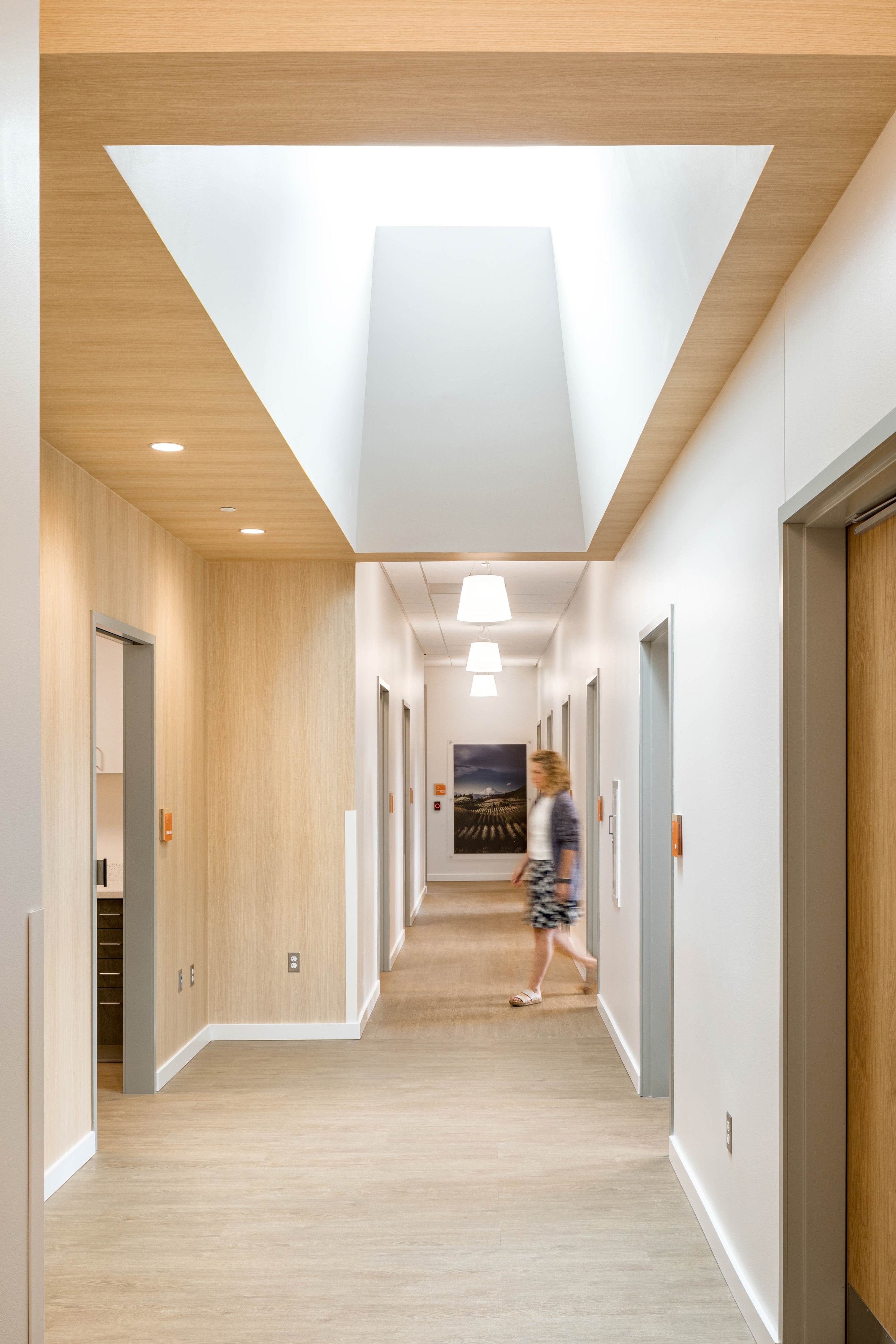
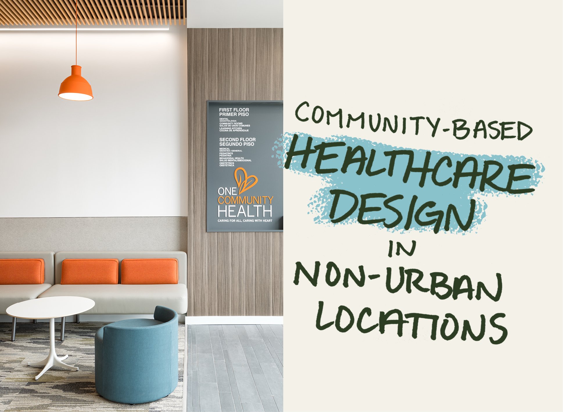
One Community Heath (OCH) in Hood River, Oregon, is an integrated health facility focusing on whole-person team-based care. Scott Edwards Architecture served as both interior designer and architect, and together with the project team reimagined and replaced OCH’s existing facility on the site with a new facility. OCH needed to be a welcoming and functional space that also coordinated with their recently updated branding package. Essential elements included signage, wayfinding, and wall protection in their circulation areas. We identified creative ways to elevate the essentials using color, reoccurring materials, and unexpected ‘moments’.
One of the best interior design strategies is to emphasize wood textures. Wood accents create a biophilic and calming environment. We selected an affordable woodgrain wallcovering to capture the design intent and break up swaths of white paint that can have a negative psychological impact in clinical settings. We knew that in this space, a little applied to walls and ceilings would go a long way in the design.
An essential element for Healthcare projects, in particular, is wayfinding. We took the opportunity to incorporate the client’s branding, colors, and wood tones into signage, using this reoccurring element to create a cohesive feel throughout the space. Designing signage early as part of the interiors package was key to making sure it was included in pricing and shown as an integral part of the project.
Our interior designers found an opportunity to combine wayfinding and corner guards by using brand-specific graphics. L-shaped laminate panels were designed to wrap the corner, eliminating the need for the typical plain plastic version. This unconventional approach continues the branding throughout the space in a meaningful way while elevating this basic element.
Acoustics are a very important part of building designs and should be considered one of the most necessary elements—how sound carries significantly impacts the people using the space. At One Community Health we introduced wood slat ceilings with an acoustical backer to further bring nature and warmth into the program while also serving a function. We strategically placed these elements over waiting areas, helping to indicate places that are meant for seating and that are not part of circulation.
Lighting is another element we used to carry forth branding. We selected fixtures in one of OCH’s brand colors, a vibrant orange, for a color pop in an otherwise neutral area, enlivening the space.
Case Study 2: Gladstone Civic Center
The Gladstone Civic Center is a facility that houses several city departments and serves as a landmark for the community. This active public building has multiple hard surfaces in the lobby, and our Interiors team accounted for this by working acoustical dampening into the design. The lobby’s decorative wall treatment comes from a Eugene, Oregon manufacturer, and creates warmth and texture in the space. Fabric-wrapped acoustical panels were installed behind the wood slats and horizontal support members were painted to match so that the vertical wood slats could stand alone as a feature. Additionally, the treatment creates a visual rhythm that extends down the hallway, encouraging circulation and leading visitors through the space to the different departments.
We carried this feature into the city council chamber as well, both to help with acoustics and create an interesting backdrop for meetings, which are often televised or recorded.
In the training room, we found another opportunity to take an essential element and use it as a design moment. We needed acoustical dampening in the space and were able to achieve it using full height, carved felt panels which add texture and biophilia with a stylized tree pattern.
Case Study 3: Acme Construction Supply Headquarters
Acme Construction Supply Headquarters is an office serving as HQ for the company’s administrative staff. When we started this project, we could feel the energetic and compassionate company culture. Acme looked to the Scott Edwards Architecture Interiors team to design a headquarters that reflected the company’s fun and industrial nature and it needed to be accomplished within the confines of a straightforward, no fluff budget.
Our approach to this project asks the same questions our other case studies do – how do we elevate basic elements in creative ways and work from a palette that supports their brand? The floors presented a place for an impactful design choice that would carry throughout the space. We used affordable LVT and carpet planks but opted for creative installation patterns. We installed the LVT on a diagonal which supported the language of angles found in Acme’s logo. In the conference room we used affordable carpet tiles, selecting three different shades and arranging them in a playful buffalo check pattern.
We found ways to incorporate Acme’s brand red in fun pops of color throughout the interior.
Within the building we identified the need to create screening in an open space and an accent wall in a small conference room. Rather than purchasing an expensive off-the-shelf item, we considered alternatives. Our designers thought about the overall aesthetic as well as the client’s industry, ultimately deciding to use 1x4 Hemlock to build exposed slats that could also be used to hang design tools and marker boards – exposing construction felt fitting for a tool company.
Doors can sometimes be overlooked as a feature element when it comes to interior design. Rather than specifying paint grade doors on the entire project, at Acme we looked for opportunities to utilize them as part of the design language. We saw a place to do so with the office’s corridor mail closet – we achieved acoustic properties on the door by applying ½” laser cut felt to a door frame that slides along a track. The eye-catching pattern is unexpected in its placement and makes an impression.
The important takeaway here is that you do not always need to add scope to achieve good design. A willingness to create moments using essential elements, coupled with a strong understanding of the client’s goals, can lead to creative solutions. By putting the budget toward something that is already needed we can take the design a step further, elevating it not only in form and function, but to a more meaningful and unique interior space.


